Text Component: Difference between revisions
Jump to navigation
Jump to search
(Initial content) |
mNo edit summary |
||
| (7 intermediate revisions by one other user not shown) | |||
| Line 1: | Line 1: | ||
The Text Component allows text to be displayed in the world. | The Text Component is a [[:Category:Rendering Components|rendering component]] that allows text to be displayed in the world. | ||
== Component Settings == | == Component Settings == | ||
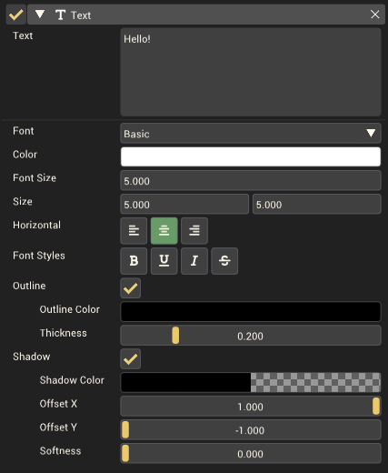
[[File:TextComponentInInspector.png|thumb|right|600px|The Text component in the inspector.]] | |||
{| class="wikitable" | {| class="wikitable" | ||
|- | |- | ||
| Line 16: | Line 17: | ||
| '''Size''' || The space available for the text to fill. The text will wrap if it extends beyond the width of this size. | | '''Size''' || The space available for the text to fill. The text will wrap if it extends beyond the width of this size. | ||
|- | |- | ||
| '''Horizontal''' || The horizontal alignment of the text. Available | | '''Horizontal''' || The horizontal alignment of the text. Available alignments are ''Left aligned'', ''Centered'' and ''Right aligned''. | ||
|- | |- | ||
| '''Font Styles''' || Change the style of the text. Available styles are ''Bold'', ''Underline'', ''Italic'' and ''Strikethrough''. | | '''Font Styles''' || Change the style of the text. Available styles are ''Bold'', ''Underline'', ''Italic'' and ''Strikethrough''. | ||
| Line 22: | Line 23: | ||
| '''Outline''' || Should the text have an outline. | | '''Outline''' || Should the text have an outline. | ||
|- | |- | ||
| style="padding-left: | | style="padding-left: 1em;" | '''Outline Color''' || The color of the outline. | ||
|- | |- | ||
| style="padding-left: | | style="padding-left: 1em;" | '''Thickness''' || The thickness of the outline. | ||
|- | |- | ||
| '''Shadow''' || Should the text have a shadow. This shadow is placed behind the text and can help it stand out. | | '''Shadow''' || Should the text have a shadow. This shadow is placed behind the text and can help it stand out. | ||
|- | |- | ||
| style="padding-left: | | style="padding-left: 1em;" | '''Shadow Color''' || The color of the shadow. | ||
|- | |- | ||
| style="padding-left: | | style="padding-left: 1em;" | '''Offset X''' || The shadow's horizontal offset. Ranges from -1 to 1. | ||
|- | |- | ||
| style="padding-left: | | style="padding-left: 1em;" | '''Offset Y''' || The shadow's vertical offset. Ranges from -1 to 1. | ||
|- | |- | ||
| style="padding-left: | | style="padding-left: 1em;" | '''Softness''' || The softness or fuzziness of the shadow. 0 results in a crisp shadow with hard edges. 1 gives a blurry shadow with blended edges. | ||
|} | |} | ||
<br clear="all"> | |||
==Formatted text== | |||
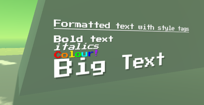
[[File:FormattedTextExample.png|thumb|right|600px|Style tags have been used here to style the text in many ways within a single text component.]] | |||
By changing the style options in the inspector, you can adjust the style of all text in the text component. There is also a way to use style tags to only style some words or characters. | |||
'''Available style tags''' | |||
{| class="wikitable" | |||
|- | |||
! Style!! Tags !! Example !! Result | |||
|- | |||
| '''Underline''' || <nowiki><u></nowiki>...<nowiki></u></nowiki> || <nowiki><u></nowiki>This text is underlined<nowiki></u></nowiki> || <u>This text is underlined</u> | |||
|- | |||
| '''Bold''' || <nowiki><b></nowiki>...<nowiki></b></nowiki> || <nowiki><b></nowiki>This text is bold<nowiki></b></nowiki> || '''This text is bold''' | |||
|- | |||
| '''Italics''' || <nowiki><i></nowiki>...<nowiki></i></nowiki> || <nowiki><i></nowiki>This text is italic<nowiki></i></nowiki> || ''This text is italic'' | |||
|- | |||
| '''Set Color''' || <color=''color name''>...</color> <br><color=''Color hex code''>...</color> || <color=red>This text is red</color> <br><color=#00FFFF>This text is cyan</color> || <span style="color:#FF0000">This text is red</span> <br> <span style="color:#00FFFF">This text is cyan</span> | |||
|- | |||
| '''Font Size''' || <size=''font size''>....</size> || <size=24>This text is size 24</size> || <span style="font-size:24px">This text is size 24</span> | |||
|- | |||
|} | |||
The text in the example image for this section has the following text | |||
<nowiki><u></nowiki>Formatted text with style tags<nowiki></u></nowiki><nowiki> | |||
</nowiki> | |||
<nowiki><b></nowiki>Bold text<nowiki></b></nowiki> | |||
<nowiki><i></nowiki>italics<nowiki></i></nowiki> | |||
<color=red>C</color><color=orange>o</color><color=yellow>l</color><color=green>o</color><color=#00FFFF>u</color><color=blue>r</color><color=purple>!</color> | |||
<size=8>Big Text</size> | |||
You can paste this into the mod editor to achieve the same result. | |||
== Example Usage == | |||
=== Signs === | |||
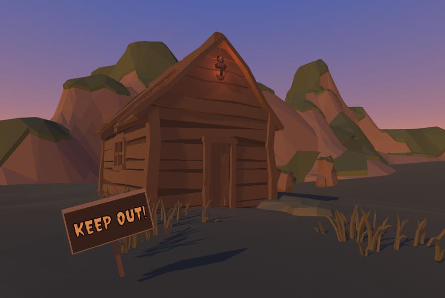
The text component can be combined with props to make signs. | |||
[[File:TextComponentExampleKeepOutSign.jpg|thumb|none|600px|Text aligned with other props can create a sign.]] | |||
=== Guide the player === | |||
If any part of the minigame needs explanation, a text component can be used to provide information or guidance to players. Try to minimize this however as it makes the minigame less accessible to players of other languages. | |||
[[Category:Rendering Components]] | |||
[[Category:Components]] | |||
Latest revision as of 01:07, 16 December 2022
The Text Component is a rendering component that allows text to be displayed in the world.
Component Settings
| Property | Description |
|---|---|
| Text | The text to be displayed in the world by the Text Component. |
| Font | The font used to render the text. |
| Color | The color of the text. |
| Font Size | How large the text is rendered. |
| Size | The space available for the text to fill. The text will wrap if it extends beyond the width of this size. |
| Horizontal | The horizontal alignment of the text. Available alignments are Left aligned, Centered and Right aligned. |
| Font Styles | Change the style of the text. Available styles are Bold, Underline, Italic and Strikethrough. |
| Outline | Should the text have an outline. |
| Outline Color | The color of the outline. |
| Thickness | The thickness of the outline. |
| Shadow | Should the text have a shadow. This shadow is placed behind the text and can help it stand out. |
| Shadow Color | The color of the shadow. |
| Offset X | The shadow's horizontal offset. Ranges from -1 to 1. |
| Offset Y | The shadow's vertical offset. Ranges from -1 to 1. |
| Softness | The softness or fuzziness of the shadow. 0 results in a crisp shadow with hard edges. 1 gives a blurry shadow with blended edges. |
Formatted text
By changing the style options in the inspector, you can adjust the style of all text in the text component. There is also a way to use style tags to only style some words or characters.
Available style tags
| Style | Tags | Example | Result |
|---|---|---|---|
| Underline | <u>...</u> | <u>This text is underlined</u> | This text is underlined |
| Bold | <b>...</b> | <b>This text is bold</b> | This text is bold |
| Italics | <i>...</i> | <i>This text is italic</i> | This text is italic |
| Set Color | <color=color name>...</color> <color=Color hex code>...</color> |
<color=red>This text is red</color> <color=#00FFFF>This text is cyan</color> |
This text is red This text is cyan |
| Font Size | <size=font size>....</size> | <size=24>This text is size 24</size> | This text is size 24 |
The text in the example image for this section has the following text
 <u>Formatted text with style tags</u>

 <b>Bold text</b>
 <i>italics</i>
 <color=red>C</color><color=orange>o</color><color=yellow>l</color><color=green>o</color><color=#00FFFF>u</color><color=blue>r</color><color=purple>!</color>
 <size=8>Big Text</size>
You can paste this into the mod editor to achieve the same result.
Example Usage
Signs
The text component can be combined with props to make signs.
Guide the player
If any part of the minigame needs explanation, a text component can be used to provide information or guidance to players. Try to minimize this however as it makes the minigame less accessible to players of other languages.


