Text Component
Jump to navigation
Jump to search
The Text Component is a rendering component that allows text to be displayed in the world.
Component Settings
| Property | Description |
|---|---|
| Text | The text to be displayed in the world by the Text Component. |
| Font | The font used to render the text. |
| Color | The color of the text. |
| Font Size | How large the text is rendered. |
| Size | The space available for the text to fill. The text will wrap if it extends beyond the width of this size. |
| Horizontal | The horizontal alignment of the text. Available alignment are Left aligned, Centered and Right aligned. |
| Font Styles | Change the style of the text. Available styles are Bold, Underline, Italic and Strikethrough. |
| Outline | Should the text have an outline. |
| Outline Color | The color of the outline. |
| Thickness | The thickness of the outline. |
| Shadow | Should the text have a shadow. This shadow is placed behind the text and can help it stand out. |
| Shadow Color | The color of the shadow. |
| Offset X | The shadow's horizontal offset. Ranges from -1 to 1. |
| Offset Y | The shadow's vertical offset. Ranges from -1 to 1. |
| Softness | The softness or fuzziness of the shadow. 0 results in a crisp shadow with hard edges. 1 gives a blurry shadow with blended edges. |
Example Usage
Signs
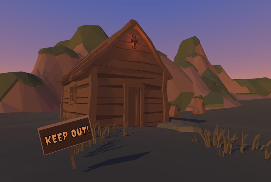
The text component can be combined with props to make signs.
Guide the player
If any part of the minigame needs explanation, a text component can be used to provide information or guidance to players. Try to minimize this however as it makes the minigame less accessible to players of other languages.
